Have you ever considered how important your font can be?
Think about it this way: Have you ever read something and mistook one letter for another? And for a moment, you have to do a double take and figure out what’s actually being said.
Like, there’s no wayyy that a grocery store is actually selling key lime farts. Right???:

Sooo many questions here.
Giggles aside, this is just one of the more ~appropriate~ examples of bad font choices. And you may be surprised to learn that even the most well-known and seemingly thoughtful brands are guilty of this offense.
Choice of web font makes a huge difference, particularly when used for digital marketing on the web and in email and visual design. Even font style and font size make a huge difference in how consumers perceive your brand. Your font can support a certain theme, contribute to the overall feeling and personality of a piece and can seriously make or break your messaging.
Today we’re talking about font selection as it relates to email marketing. When choosing the font you use in your brand’s email campaigns, there are a few things to take note of.
Is font really that big of a deal?
Ummmm …YES. Fonts come in all kinds of different styles and sizes, and the way letters are displayed across email clients – including shape and spacing – can all have an impact on your reader. For instance, take a look at some of the examples provided by Really Good Emails.
The typeface you choose has a personality and conveys a message all its own. So when things look a little off, or simply don’t line up with your message and overall brand image, your prospects will notice. There are certain web safe fonts that you want to keep in mind if you want to keep readers from thinking “What the…?”
Take, for example, poor Ralph and Joe, who made an unfortunate font choice for their masonry company.

Sorry, boys, but if your tilework looks anything like your font choice, I won’t be hiring you for my kitchen remodel anytime soon.
Here’s another one:

Feeling calm yet? YA SURE???
Here, we can see that factors like punctuation and color choice play a significant role as well.
Let’s try something more like:

That’s much better.
Worse still, when your font is off, readership and understanding will fall off as well. Recipients can easily get distracted by As that look like Cs, or say, the use of a fun, playful web font within a professional email with a serious message. A web font that does align with your message and brand image, on the other hand, can help keep recipients’ attention, improving overall click-through rates.
Choosing your font: Things to think about
Before selecting your email font, there are few questions you should answer first:
- Why should we care about the best fonts to use in email? Font size, font style and overall font type make a major difference in the way you promote your brand and your message via email. A default font can have a very different impact on readers than a custom font. Font choice is a major representation of your voice and your brand, and can make or break your first impression with consumers.
- What kind of message are you looking to send? Is the email about something fun and exciting? Or does it have a more formal, weighty tone? All of this should play into your font choice.
- Will you use the same font throughout? Are you looking for uniformity, or to shake things up a bit? Keep in mind, though, that best practice says you should avoid using more than two fonts. Email Monks’ Kevin George pointed out that pairing a decorative font with a more simple font can be a good way to support brand personality. But remember, we’re not kids playing in a word processor anymore – it’s important not to go overboard.
- To bold or not to bold? Bolding certain words, or using italics can change the way a font displays and can impact overall message and understanding.
- What color will you use? It’s important to think about things like background color here to ensure readers won’t have trouble. Also, keep branding and your company colors in mind, particularly with email signatures.
- Will these be HTML or plain text emails? HTML allows you to include hyperlinks, custom fonts and other design and visual elements and are typically the best for supporting marketing campaigns and encouraging click-throughs.
- Is it legible? I mean, that’s the whole point, right? Remember to consider things like the shape of letters (certain letters can easily be mistaken for others in cursive, more flowery script) and spacing, especially in design. It’s also important to think about how things will display on different size screens, particularly on mobile devices.
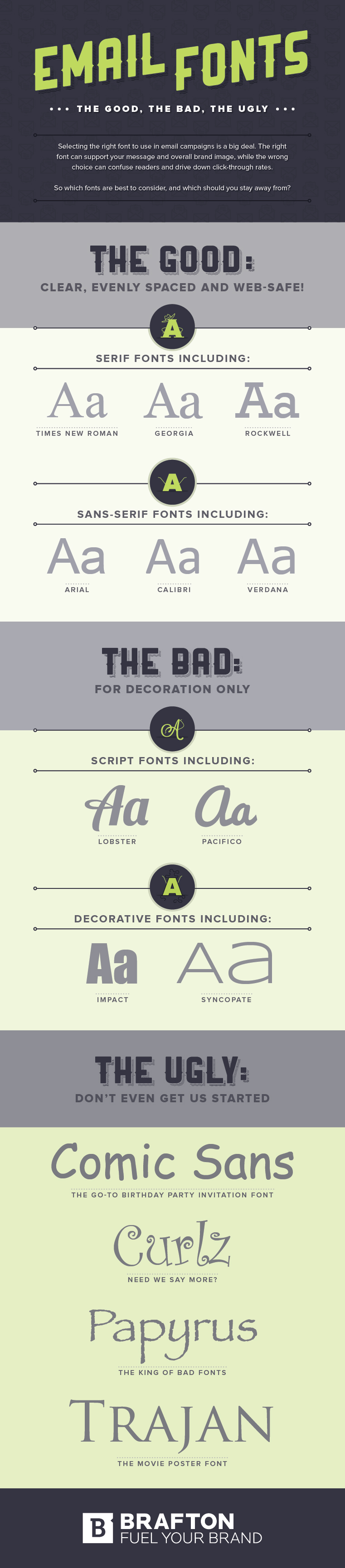
Fonts: The good
Choosing the right font family can make email body copy simple and satisfying.
All that being said, there are a few typeface families that have proven to be web-safe, easy to read for email body copy and some of the best cross-platform fonts.
Serif font is characterized by short tails at the edges of letters that help lead readers’ eyes from one letter to the next.
Serif font is characterized by short tails at the edges of letters that help lead readers’ eyes from one letter to the next.
See:
Times New Roman [a favorite for college essays]

Georgia

Rockwell

These fonts are often used in print as they’re easier to read that other, fancier fonts – I bet your favorite book is written in Times. Writers looking for something that’s clear but also more formal and business-like should use Serif fonts.
Sans-serif includes characters without any lines or tails (get it? SANS-serif?). You may recognize these as your email default font. Brafton uses Sans-serif for many of our emails and employee email signatures, as these are some of the most web-safe fonts.
Sans-serif includes characters without any lines or tails (get it? SANS-serif?). You may recognize these as your email default font. Brafton uses Sans-serif for many of our emails and employee email signatures, as these are some of the most web-safe fonts.
This font family supports a more casual tone and includes:
Arial

Calibri

Verdana

These are often top choices for email body text as they’re clear, evenly spaced and simple to read on almost any screen size. Arial is an easy choice because it’s often a default font; this makes choosing one of the most web safe fonts virtually effortless.
Fonts: The bad
Certain fonts – unless you’re going for a wacky, zany kind of feel (like, you’re a toy company, or something) – are best to stay away from, especially in the body copy of emails. However, depending on the message you’re sending, these fonts may have their place in certain parts of your email, like headers.
Script fonts look a lot like handwritten cursive, and many are only just a taaad bit clearer than the last prescription you got from your doctor.

This includes fonts like:
Lobster and Pacifico.


While these can provide a fancier, and even more personal feel (because they look like handwriting), prospects won’t appreciate having to squint to decipher the message.
Decorative fonts are typically used only for logos, taglines or headings because they’re usually more bold and attention-grabbing than other fonts.
Think:
Impact

Syncopate

If you’ve decided to mix fonts in your email, you might consider a more robust decorative font for the headline, paired with a more standard and clear font for body text. When used sparingly and specifically at large scale, script and decorative fonts like this can provide statement pieces in design, and evoke a certain mood or emotion from readers. However, these fonts must be large enough to read, and should only be used in moderation.
The ugly: Avoid at all costs
Okay, we’ve come to my favorite part. These are fonts that we all recognize, even if not by name. However, it’s (almost) universally agreed that these bad boys shouldn’t appear in emails:
- Comic Sans: No. Just … just stop. Unless you’re sending an invitation to your kid’s birthday party, no reader wants to see this.
- Curlz: Need I say more?
- Trajan: You might recognize this one from just about every movie poster you’ve seen in the last few years (aside from Avatar, which, haha, used Papyrus). Because this is a widely available font, it’s become sort of all-purpose. Basically, we can do better for your email copy.
- Papyrus: WebDesignerDepot has dubbed this one “the king of bad fonts,” following it up with “equal parts childish, kitschy and irritating,” and I don’t think I could have described it better. Google doesn’t even support this font (or Curlz or Trajan, for that matter) in Gdocs – and that’s saying something.
- Helvetica: This is more of my own personal preference because I had a newspaper editor in college who was obsessed with this font and made us adjust the whole style of our paper because they loved it so much. I still have nightmares where “Everything must be in Helvetica!!!” is being chanted in the background. (SPOOKY.) In any case, WebDesignerDepot agrees with me here, noting that while Helvetica is versatile and very visible, it’s also become rather overused.
The font you choose has a big impact. I mean, if I wrote this whole piece in this annoying font, you probably would have stopped reading wayyyy before now, no? You didn’t even read that, and I don’t blame you.
So remember: Different font styles make an impact. Serif and sans-serif fonts like Arial are your best friend. Keep your typeface consistent, but have a fallback font. Custom fonts can also be valuable as long as you keep it clean and legible, but sticking to a tried and true safe font family can improve your email engagement in the long run.
Editor’s Note: Updated May 2021.